Don’t use clever 3D effects in pie charts and bar charts.
You will often see 3D effects on pie charts and bar charts in the news media. They like to do this because the colors pop and the 3D effects make it look like the statistician partnered with a graphics artists to make the story more interesting. In these cases, the mode of delivery is more important than the actual content. If they retain your interest, you’re less likely to change the channel. They really don’t care if you actually understand the statistics.
When you are making a presentation of data, you should endeavor to show the truth. Communicate what the numbers truly mean. Sometimes, this is more simply done in a table of data. Often there is no need to resort to charts and graphs.
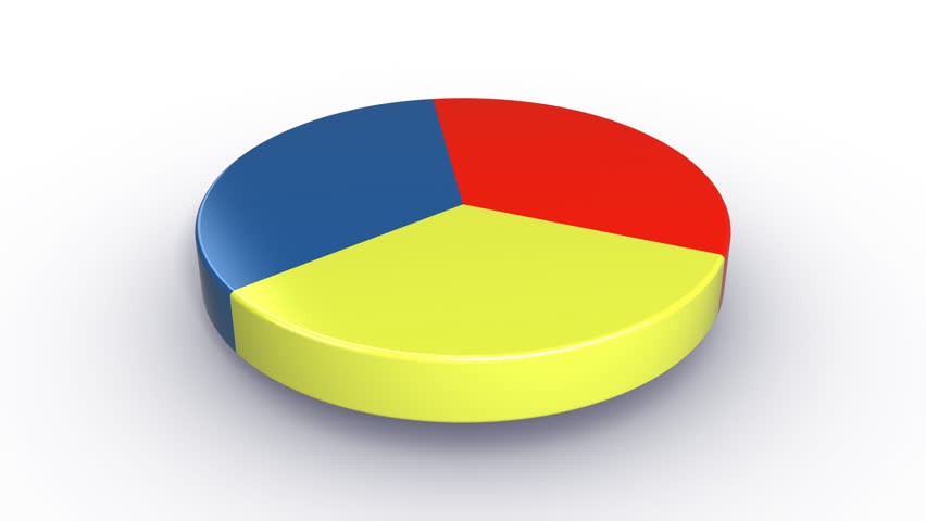
The problem with 3D pie charts is that the portion on the bottom shows more surface area than the other slices. This can exaggerate the value of the bottom slice compared to other slices. Often it is difficult to have a good sense of the relative sizes of the slices when 3D effects are used.
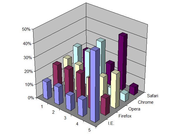
Similarly, 3D bar charts make it very difficult for the reader to tell what the numerical values of each bar are. It’s hard to tell where the zero line starts, and whether to use the front, back, or center of the top of the bar when comparing against the axis. Furthermore, some bars can block the view other bars. These difficulties lead to the hiding of information and making the reader confused.
If you are in a business situation where you feel you need to deceive the reader by creating these poor charts, you should reconsider your position. The numbers are the numbers, just deliver them as they are.
